Continuous data
Numerical data that can take any value within a given range, e.g. heights and weights.
Discrete data
Numerical data that can only take certain values, e.g. shoe size
Quantitative data
Results that can be expressed using numerical values.
Qualitative data
Results that can’t be expressed as numbers, e.g. opinions
What a histogram is.
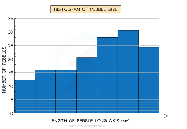
A bar chart is used to compare categorical data while histograms are used to analyse the distribution of data.
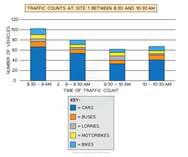
Divided bar chart
Rose diagram
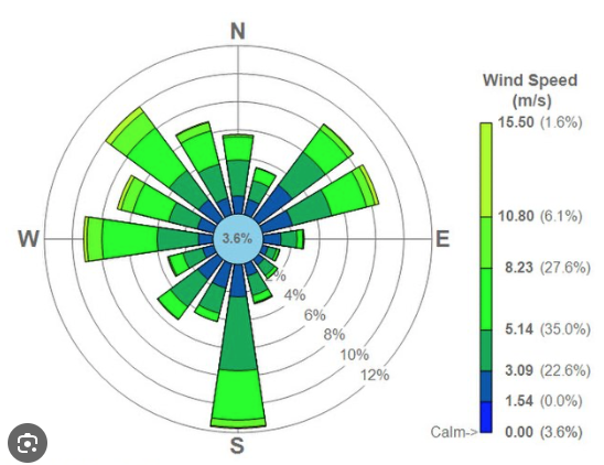
Diagram often used for wind, that shows how much at each direction and on what speed.
Triangular graph
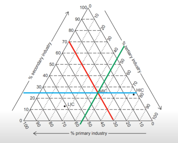
Have axes on three sides all of which go from 0-100 which show percentages, data which is divided into 3. Draw a line from each side on its percent and where they meet is the point.
Scatter graph
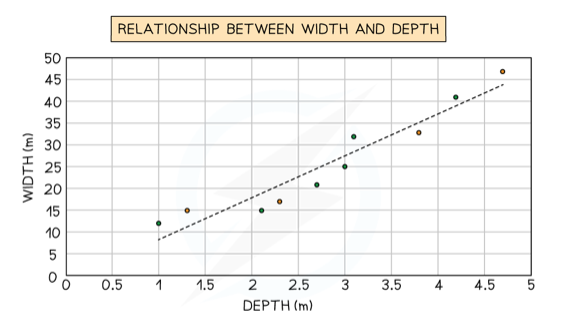
Used to show the relationship between two variables, the best fit line can be added to show the relations.
Choropleth map
Maps which are shaded according to a pre-arranged key with each shade representing a range of value.
Proportional symbols map
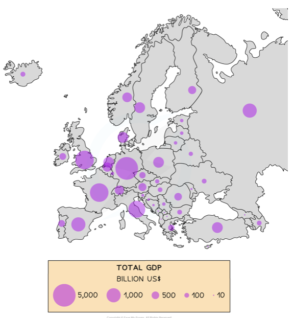
The symbols on the map are drawn in proportion to the variable represented, can be circles but also other shapes.
Pictograms
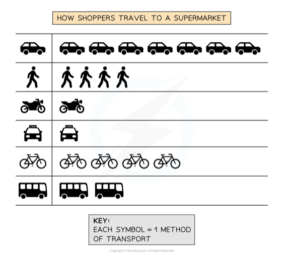
These are a way of displaying data using symbols or diagrams on a graph.